2025 Color Trends: Stunning Indoor & Outdoor Styles You’ll Love
2025 is all about creating spaces that feel calm, connected, and effortlessly stylish. This year’s top color trends blend balance, nature, and modern comfort. Homeowners and designers alike are turning to earthy tones, organic textures, and bold accents that add personality without overpowering a space.
Whether you’re updating your living room, refreshing your patio, or adding curb appeal, this guide will show you the must-have paint colors and combinations for the year.
A Shift Toward Nature-Inspired Design
Color choices are more than just style—they influence mood, support wellness, and even raise property value. In 2025, interior and exterior trends are heavily inspired by:
Sustainability
Biophilic design
Wellness-focused living
At Visionary Handyman Services (VHS), we believe in transparency and honesty. To support our business and continue providing valuable home improvement content, we participate in affiliate marketing programs. This means that when you click on certain links on our website and make a purchase, we may earn a small commission at no extra cost to you.
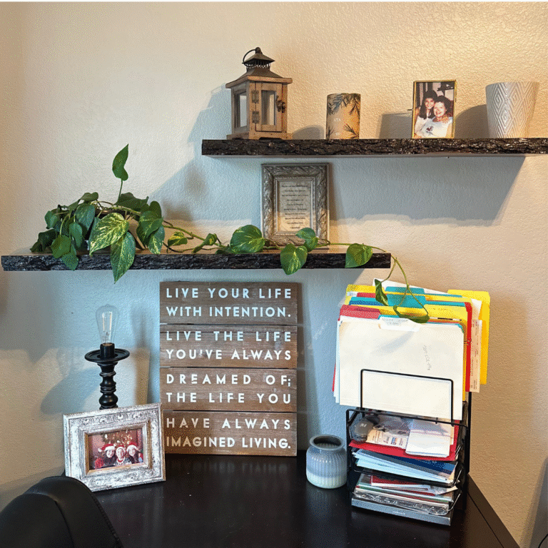
Top Indoor Color Trends for 2025

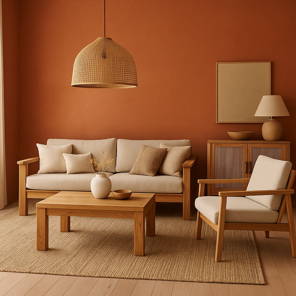
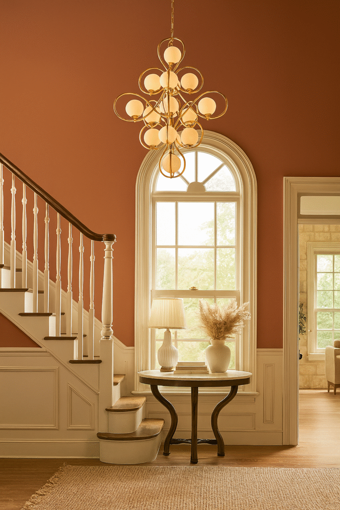
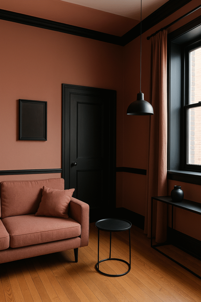
Clay and Terracotta Tones
Clay and terracotta tones draw inspiration from sunbaked earth, pottery, and desert landscapes. These colors span a range from soft peachy blushes to deep rusty oranges, incorporating hints of brown, red, and orange. Think of the hue of fired clay pots, adobe walls, or the warm glow of late afternoon sun.
Why They Work: The Emotional and Visual Appeal
- Warm & Inviting : These hues naturally radiate warmth, making a space feel cozy, grounded, and welcoming. Whether bold or muted, they carry a sun-drenched quality that adds comfort and charm to any room.
- Grounding & Centering : The earthy nature of these tones helps create a calming, rooted atmosphere—perfect for spaces where you want to unwind, connect, or gather.
Versatility Across Styles
- Modern Boho: Pair with rattan, greenery, and natural textures.
- Mediterranean or Tuscan: Use alongside deep blues, stucco textures, or rustic wood.
- Minimalist Earthy: Combine with soft neutrals like cream, linen white, or greige.

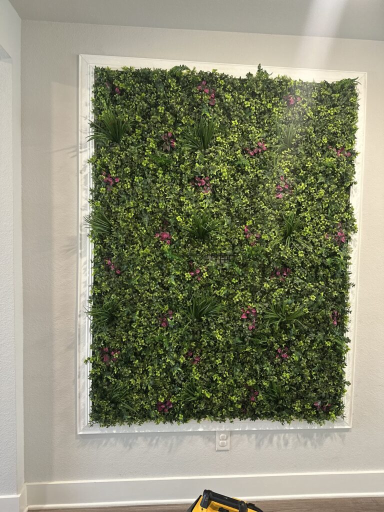
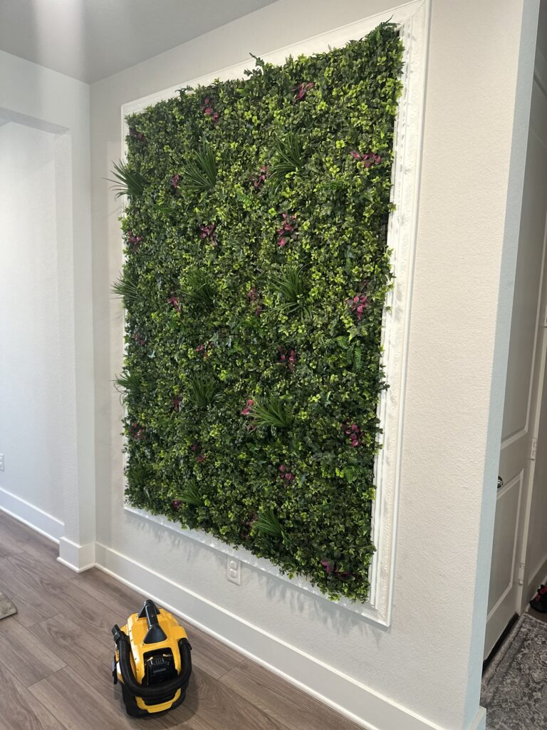
Soft Sage and Botanical Greens.
These colors promote a calming atmosphere, perfect for bedrooms and home offices.


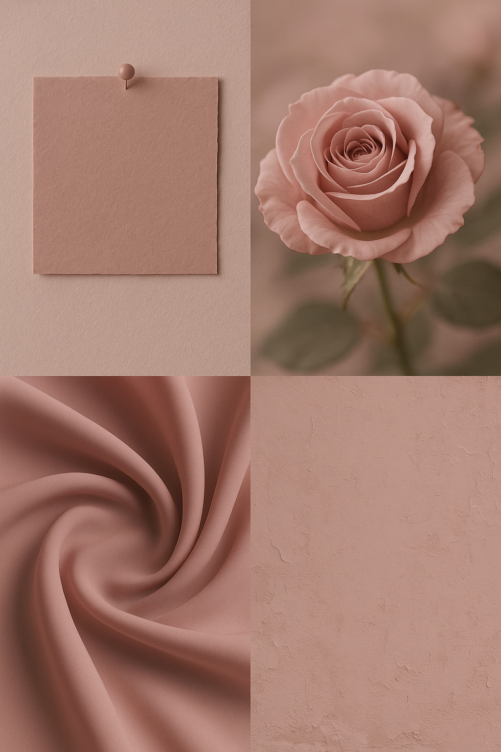
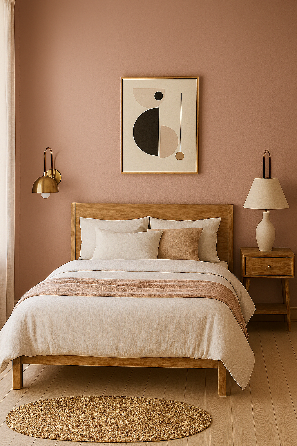
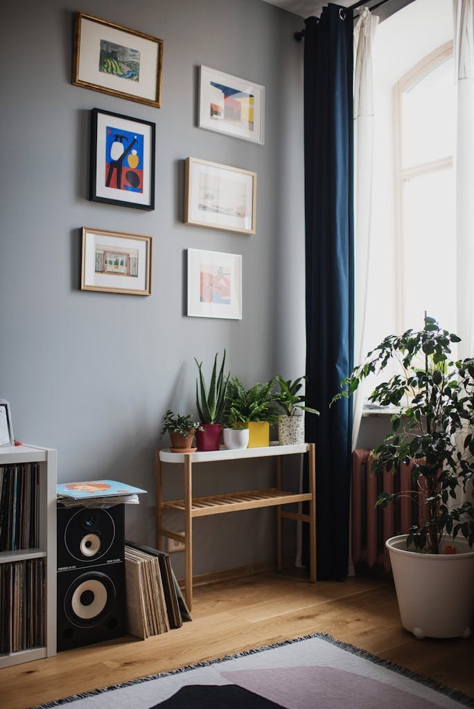
Muted Blush and Dusty Rose
Muted Blush and Dusty Rose represent a new era of soft, sophisticated design. While historically associated with traditionally feminine aesthetics, today these colors have evolved into modern neutrals with an edge — warm, grounded, and incredibly versatile.
Why These Tones Work:
Muted Blush brings a soft, barely-there pink that feels warm without being overtly romantic. It’s airy and modern, often used in place of white or beige.
Dusty Rose adds depth with a vintage feel — it’s more saturated than blush but still subtle, evoking warmth and comfort.
Together creating a layered palette that’s gentle on the eyes yet full of character.
Brass and Matte Black are good pairing for Muted Blush and Dusty Rose
Brass complements the warm undertones of blush and rose without clashing, and works well for:
- Light fixtures
- Door hardware
- House numbers
- Accent trim
By adding Matte Black you can create bold contrast adds modern structure and balance to the softness of the pink tones.
It’s especially effective for:
- Window frames
- Railings
- Garage doors or trim lines
- Sconces
When used strategically, matte black keeps the palette anchored and contemporary, avoiding the overly “sweet” or overly vintage feel that pinks alone might create.
Charcoal Neutrals
Deep gray tones are a stylish and timeless choice for modern interiors, adding richness and sophistication to any space. In bathrooms, they create a serene, spa-like feel when combined with crisp whites and natural textures. Meanwhile, kitchens benefit from deep gray’s bold yet balanced presence, especially on cabinets or accent walls paired with sleek finishes. This versatile hue also shines in living areas, offering a cozy, neutral backdrop that highlights colorful décor and luxurious textures.
Why It Works
- Timeless Appeal : Gray never goes out of style—it adapts to modern, classic, or industrial design.
- Flexible Neutral : Acting as a grounding backdrop while allowing other design elements to shine.
- Emotional Depth : Evokes feelings of calm, sophistication, and stability.
- Easy Pairing : Pairs effortlessly with whites, golds, greens, and natural materials.

Top Outdoor Color Trends for 2025
Greys and Whites
When it comes to elevating curb appeal, nothing speaks modern sophistication like a well-balanced mix of greys and whites.
These shades offer a clean, versatile backdrop that works across architectural styles — from sleek contemporary to cozy craftsman homes.
Why It Works:
- Neutral but impactful : Greys bring depth without overwhelming, while whites add brightness and freshness.
- All-season aesthetic : These tones look stunning under summer sun or against a snowy backdrop.
- Pairs beautifully : Accent doors, planters, and fixtures in black, natural wood, or brushed brass complement perfectly.
Whether you’re repainting or designing from scratch, grey and white exteriors exude confidence and elegance — making your home feel both timeless and on-trend.
Earthy Browns and Sandstones
Rich earthy browns and warm sandstone tones create a timeless palette that brings out the organic charm of a home’s exterior. These hues echo the natural world — from soil and bark to sunbaked stone — making them an ideal choice for homeowners seeking harmony with the landscape.
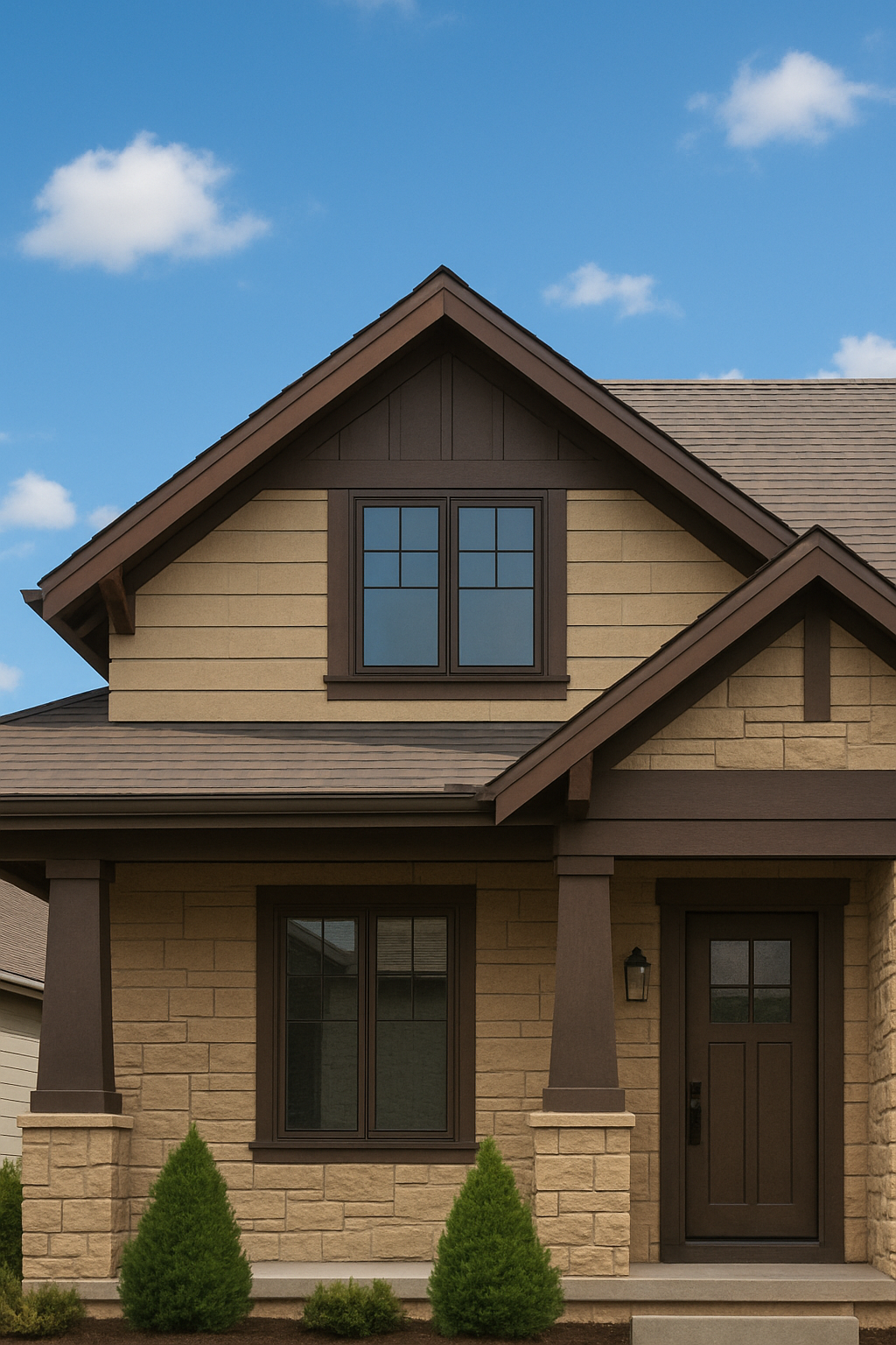
Why It Works:
- Natural integration : These tones visually anchor the home to its surroundings, blending seamlessly with everything from wooded lots to desert terrain.
- Timeless character : Sandstone’s pale beige base softens the visual weight of deep browns, offering a warm yet sophisticated contrast.
- Texture-friendly : This palette enhances materials like stone veneer, cedar, stucco, and brick, highlighting depth and craftsmanship.
Whether nestled in the countryside or lining a suburban street, exteriors finished in earthy browns and sandstone offer a look that’s both inviting and enduring — a perfect balance between rugged charm and understated luxury.

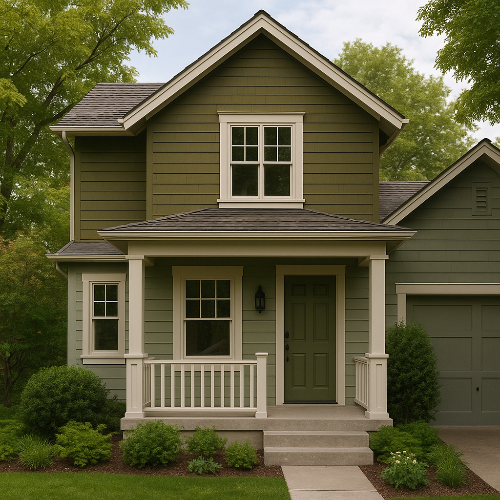
Olive Green and Dusty Sage
Olive green and dusty sage are both muted, earthy greens that lend a grounded, calming feel to home exteriors. These tones evoke nature, subtly blending into landscaping while still standing out with elegance and charm.
Design Ideas
- Full Facade Options All-over Olive Green: Works well with stone accents and a darker roofline for a rustic-chic look.
- Texture Pairings Natural Stone or Wood: Complements the subdued greens and enhances the organic feel.